How loose is too loose?
This is a question I often find myself wrestling with when thinking about my own painting. While I greatly admire the work of artists who are able to convey a sense of “the thing” with the minimum of brushwork, I often struggle with the idea that “loose” equates to sloppy or unskilled. I’ve been thinking about one of my all-time heroes, the amazing John Singer Sargent, with respect to this very conundrum. Look at this work, available to view in the Ashmolean Museum, Oxford:
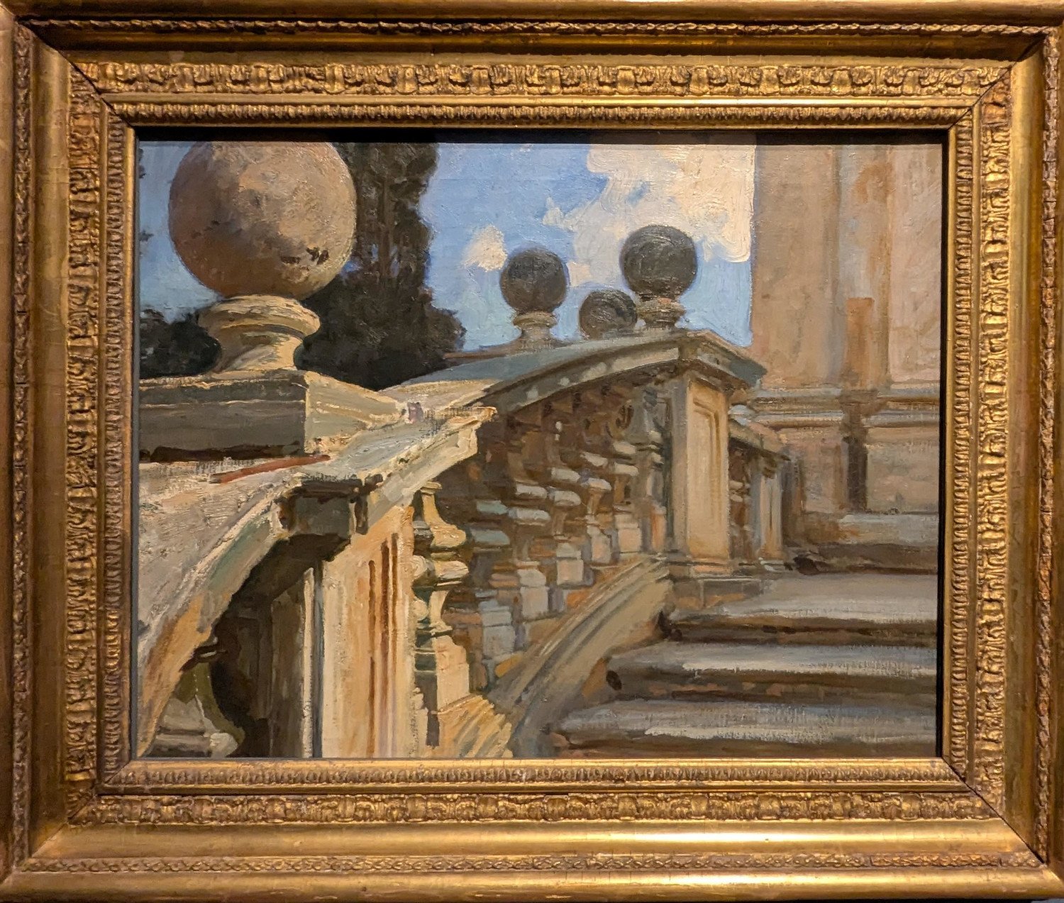
My (stunning) wife would say of a painting like this that she doesn’t like the subject or the colours. However, when standing across the other side of the gallery, we were both absolutely taken with the feeling of light, air and space that Singer Sargent managed to capture in this fairly mundane subject. For him, perhaps, this was just a study, a mere test of his painting powers, but it would be a very hard person indeed who could argue that he didn’t conjure a real sense of three-dimensional space from the flat canvas.
However, take another look, from close up, and one is startled by the simplicity, crudeness and (dare I say) ugliness of some of the strokes! The stones in the lower left are formed by some lumpy dollops of pigment (see below) and the front of the steps by some dry-brush work that’s roughly dragged across the surface of the underpainting! Taken individually, these marks are hardly indicative of great skill or aesthetic sensibility.
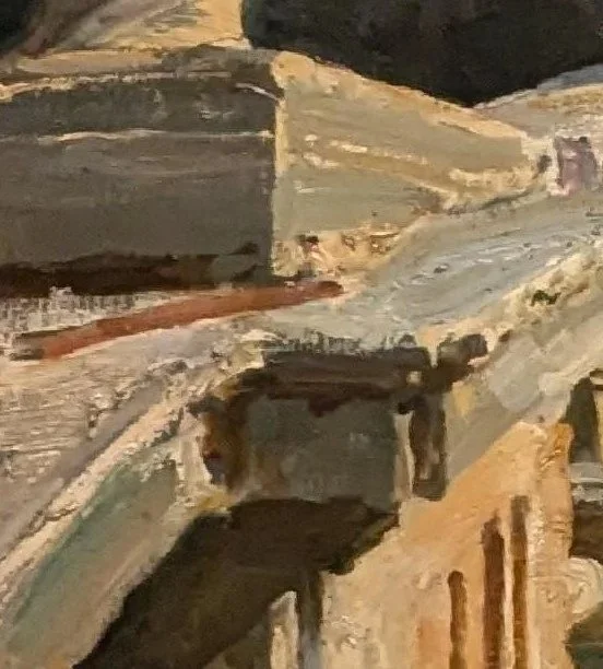
All in all they are, in fact, pretty yukky!
Yet the final result as we see and interpret it, is the impression of hard and weathered stone, partly in shade, partly in glorious sun. The stairs recede from our view towards a shaded wall and, in the background, a tall tree is silhouetted against a blue sky. How do we even know it’s a tree? There’s no leaf, no twig, nor even much of a trunk visible! Singer Sargent has painted what he has seen - disregarded the detail that is of no use to his composition, and focussed on the crucial building blocks of the view - the contrast betwen the brightly lit upper side of the ballustrade and shaded underside, defined by sharply defined breaks between light and dark, strongly define the realness of the shape. And yet there is no fiddly precision at all!
Of course, if we viewed the various components of the picture from 2 inches away from the canvas, apart from upsetting the security personnel at the museum, we may come away thinking Singer Sargent was a pretty amateurish dauber. If, however, we view the work in its entirety, we are left with an entirely different opinion - that he was a master of his craft. Loose = unskilled? Nah!